Dear Friends,
Design is inappropriate when we craft interfaces that communicate messages at a wrong time, in a wrong language or with a wrong intent. Unfortunately, inappropriate design is all around us. Plugging in a looping advertising spot on the support hotline is both annoying and disrespectful; wouldn't it make more sense to solve the customer's problem first, and then provide meaningful shopping offers later, once the customer is happy again?
Are
social sharing buttons really that effective to be placed in the most visible areas of websites, sometimes even as
“sticky" notes on the left or on the right side of the page? Are there any case studies which provide proof that these social icons are actually effective? Or are they indeed
ineffective,
barely usedand really just
annoying?
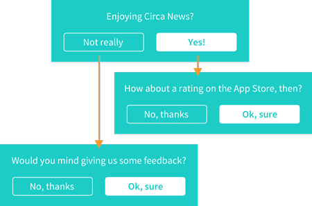
And when it comes to native apps,
pop-ups asking for reviewsare often so annoying and disruptive that they almost push users to fight back with negative and frustrating reviews. Instead, we can
integrate rating requests in a subtle and smart way, politely asking for reviews after positive experiences and kindly asking for some feedback after negative experiences.
If you have to ask yourself "but will this annoy users?", well, the answer is always a "yes". So we better design interfaces in ways that don't pose this question but provide a subtle, delightful note with clear guidelines of what a user can do to perform a certain action.
Let's design appropriately!
Vitaly (@smashingmag)
Table of Contents
1. Flexbox For The Win!
While everyone seems to agree that Flexbox is a pretty powerful layout mechanism, most front-end developers are reluctant to use it on a large scale due to the lacking browser support in IE. However,
Flexbox browser support on mobile is remarkable, so if you need to adjust or reorder components of your layout into smaller screens, Flexbox's
order property is just what you need.
However, you can do much more with Flexbox. Philip Walton has been collecting
common design patterns solved with Flexbox, and there's even an
ultimate Flexbox cheatsheet that collects reusable snippets of code for common layout issues. Then there's also
Flexy Boxes that lets you experiment with the Flexbox properties on the fly. You may also want to review
Zoe Gillenwater's "Flexbox" talk to dive deep into what is capable with Flexbox. And if you think about it as a form of progressive enhancement, there is really no reason not to use Flexbox and its advantages today.
(ml)
2. Celebrating Code As Craft
Coding is a craft you do with care and inspiration, just like others do, let's say, woodworking, sewing, or knitting. And just like every craft, coding requires a set of tools, skills, and most of all the courage to experiment. Referring to fellow developers as "crafters" however, couldn't possibly feel any more natural as in the case of the software engineer team which powers the handmade platform Etsy. It's no wonder that their team's blog carries the illustrious name "Code as Craft".
On
Code as Craft, Etsy's developers give insights into their collective experience on running their successful DIY platform. They use the blog as a place to share resources, celebrate experiments that have worked for them and write about lessons learned from the ones that went awry. A very insightful behind the scenes look at the work of fellow coders — or crafters, that is!
(cm)
3. Listen To The City's Heartbeat
Every city has its unique atmosphere, made up of its people, cultures, smells, and, well, sounds. Wandering through unknown streets, soaking up all these impressions is a wonderful way to delve into a city's rhythm, and become a part of it. But what about the places you've always wanted to visit, but haven't had the chance to, yet? The web does offer ways to explore any place that our hearts desire online, of course, yet they all lack something essential: the atmosphere. Luckily, David Vale, creator of the
Sound City Project, decided to change this.

To capture a city's heartbeat, David set out with a custom-made, four-eared gadget, the so-called “soundhead", which records sounds in high-quality 3D. From Broadway to the Norwegian Aurlandsfjord, David recorded short sequences in different places of the world, each 3 to 4 minutes long; nothing spectacular, just the sounds that surrounded him, such as people passing by, street musicians, screaming seagulls, traffic. For the
Sound City Project, he finally merged these samples with 360° photography to create a feeling as if you're actually right there. A beautiful, artistic web experience that is bound to wake your wanderlust.
(cm)
Advertisement
4. Placing Text On Images, The Smart Way
So you've got a few thumbnails or illustrations in your layout, yet some of those images are very dark, while other have a light background. In fact, these images are uploaded by content editors and change dynamically. The problem is that you have to put quite lengthy text on those images — dynamically as well. How would you solve this problem?
Well, there are many
design considerations for putting text on images, from tinting to text-in-a-box, to blurring, to floor fade and text shadow. You could also
use attribute selectors to style text different on containers with a background image than on containers without it. And if it all isn't good enough,
background-check is a little JavaScript library that automatically switches to a darker or a lighter version of an element depending on the brightness of images behind it. Just a few smart solutions for a very common design problem.
(vf)
5. Smart Thumbnails With object-fit
So you've built a perfect grid with perfectly sized product thumbnail images, perhaps in a squared size, but whenever the client uploads images with an incorrect size, they will be squished into the rectangle, potentially being incorrectly resized. You could avoid resizing issues with background-size, but what if you have to deal with good ol' source images?
We can use
object-fit to achieve just that.
object-fit: contain; "letterboxes" the images, preserving their aspect ratio. Alternatively,
object-fit: cover; has the same effect as
background-size: cover;, with every pixel in the element filled with the image, and the "leftovers" on each side cropped out.
Finally,
object-fit: none; leaves the images at its original size and correct aspect ratio, but focuses at its center, with overflow cropped. Just one thing to keep in mind: for
object-fit to work, we need to define both width and height of the box. The property is supported in Chrome, Safari, Opera and Android, and is coming to Firefox soon. You can also use a
polyfill to make it work in legacy browsers, and you can check
a few demos, too.
(vf)
6. Quick Prototyping With Paper And UI Tiles
Templates for visual flowcharts and site maps can come in handy if you want to quickly sketch interactions and explain how an interface will work. This is great if you have a consistent, sophisticated set of templates that would cover pretty much every use case you might have. If you're searching for one,
UI Tiles might be just what you need.
The set includes 72 screens in .AI, .PS and Sketch formats — from grids to board/magazine layouts, landing pages, feature pages, user profiles and comments. The only downside is that you have to submit your email to get the files. If you prefer paper prototyping,
PaperProto is a set of .STL and .PDF files, with a 3D printable model for interactive paper prototyping.
(vf)
7. Learning Has Never Been Easier
With so many techniques, tools, libraries, design patterns, strategies, abstractions, frameworks and boilerplates available nowadays, what do you really need to know to keep your workflow fast, smart and efficient? That's exactly what our front-end and RWD workshops are all about: practical front-end + RWD workshops that will help you become better front-end developers and designers, today.
Please note that you can also
subscribe to our Events Mailing List to stay informed about upcoming Smashing events. Of course, you can opt out from the list anytime. We fully respect your privacy and would never give your data to third parties.
UPCOMING ONLINE WORKSHOPS:
WORKSHOP IN OXFORD, UK:
WORKSHOP IN EDINBURGH, UK:
WORKSHOP IN ATLANTA, GA, USA:
WORKSHOPS IN LOS ANGELES, USA:
Or, if you'd like to run an
in-house workshop at your office, feel free to get in touch with Vitaly at
vitaly@smashingconf.comand briefly describe what problems you're facing and would like to solve. Don't worry about the costs — we'll find a fair price for sure. Get in touch — it's that easy!
New on Smashing Job Board
Front-End Web Developer at
Yellow7 (Little Elm, Texas)
We're looking for a front-end web developer with an intense desire to learn. This position will be responsible for initial development, maintaining, and testing web projects.
Senior UX Designer at
Apttus (San Mateo, CA)
We're looking for a senior UX designer who has a track record of creating simple but compelling user interfaces for complex functionality.
App Developer at
Booking.com (Amsterdam, NL)
We're looking for an app developer who will work with colleagues in the mobile team and with external developers to improve and implement features which our users interact with directly.
Smashing Highlights (From Our Archive)
Form-Field Validation: The Errors-Only ApproachError pages for form-field validation are dreadful. You've just filled out 20 form fields, yet you get the same bloated page thrown back in your face because a single field failed to validate.
Classes? Where We're Going, We Don't Need Classes!Classes, classes, classes everywhere. What if we don't need CSS classes at all? What if we stopped worrying about how many classes we're using and what we should be calling them and just finished with them once and for all?
All About Unicode, UTF8 & Character SetsThis is a story that dates back to the earliest days of computers. The story has a plot, well, sort of. It has competition and intrigue, as well as traversing oodles of countries and languages. There is conflict and resolution, and a happyish ending.
Recent Articles On Smashing Magazine


댓글 없음:
댓글 쓰기