Dear Friends,
We like challenges, and we like experiments. Wherever we go, we take our time to observe, to focus, to explore and to get things right. Our first stop in the US last year was theSmashingConf in New York (hint), and we have another event coming up in Whistler, Canada in just a few weeks. But, fasten your seatbelts, we also have something else in the works, and it's probably not at all what you're expecting.
SmashingConf Los Angeles 2015. Our new conference, with two days full of practical talks and smart techniques and design patterns for you to apply in your projects. We never compromise on quality, and we always emphasize the value you get from the event. Los Angeles isn't going to be an exception. Taking place on April 28–29th 2015 in Santa Monica, right next to the beach paradise across the Pacific Ocean.
Speakers, you ask? Well, the line-up is going to be as strong as you should expect it to be! The first confirmed speakers are Steve Souders, Sara Soueidan, Andy Budd and Andrew Clarke. Need to convince your boss to buy that ticket? We've got your back: download the Convince Your Boss PDF right away!
The tickets go on sale on Nov 25th at 2 PM EST (right before Thanksgiving), with an early-bird ticket price of $549 per ticket. And as usual, we'll have a few workshop options available as well. We'll keep you updated via email and @smashingconf. So you better mark your calendars and make sure not to be late!
We're looking forward to see you in LA then! ;-)
– Vitaly (@smashingmag)
– Vitaly (@smashingmag)
Table of Contents
1. Mobile Settings UX
We've all heard it before: when it comes to the current state of UX, iOS is often considered to have a much better experience, while Android is more powerful and customizable. But why? Where are the facts? Well, Luis Mena goes ahead and elaborates on The UX of Mobile Settlings, and compares the difference in experiences among Apple, Google and Microsoft device settings — probably not something that many of today's conversations are concerned about.
For example, iOS uses only (at most) 11% of screen space occupied by persistent menus, while Microsoft occupies 25% of the space. Android groups items in indented categories, while iOS 8 uses slight contrasts to group the items, and Microsoft has an unordered list of items. When it comes to ordering, iOS options start with network, device and personal settings first and so does Android, yet it's quite mixed in Microsoft's case. A few interesting insights worth considering. So how do you organize settings for your web and native apps? (il)
2. Smart Libraries For Better Web Forms
Filling in forms is still one of the most tedious, annoying, and slow activities on the web. Usually, input is very complex and difficult to navigate while correcting mistakes always turns into a competition between precision and stubbornness for users who just want to get things done. Well, there are a few little things that can improve web form UX significantly.
Let's say you want to provide a bulletproof international telephone input, then why not format the input as the user types in the data and show the flag of the country as well? For thecountry selector, we could just ask the user to type a few first characters of their country instead of going through a lengthy list of select-options. What about expanding textareas automaticallyso the user never has to scroll vertically? And perhaps storing data in localStorage, so the user never loses it?
Finally, if you do need a good selector, Select2 or Multiple SelectjQuery plugins could be helpful, and a CSS-only solution forcross-browser styling could come in handy, too. Now, here's a way to improve the UX just a little bit step by step — and get rid of those annoying fragile web forms for good! (vf)
3. Performance Matters
Building fast responsive websites is no piece of cake, but once you have a working process in place, it doesn't have to cost you more time or money. However, to ensure that performance remains a priority during the entire design and build process, you need metrics and tools that track performance and report occurring issues.
So, what if you set your performance budget (e.g. start render time under 1.1s on 3G in your city), and then use tools likePerfBar to keep collecting performance metrics? Once you've installed the script on your pages and defined what you are interested in, you can measure a number of built-in metrics that let you see performance results right away.
Alternatively, you could use WebPerf Monitor to track the PageSpeed score, Mark Zuman's SpeedCurve or grunt-perfbudget to validate your builds against a performance budget, and PerfMap Bookmarklet that visualizes performance metrics in a heatmap overlay of the page. Not enough? Perf.Rocks is a new website that collects useful articles, tools, talks and slides about web performance optimization which should have you covered for quite some time. So let's make the web faster, shall we? (vf)
4. Small Hacks, Faster Growth
Pushing your product forward doesn't necessarily require big, costly marketing strategies. In fact, sometimes it's the small details that can have a significant impact when it comes to fostering growth, acquiring new customers, and increasing revenue. Javier Sanz is one of the folks out there who constantly keeps his eyes open for such interesting little tweaks, i.e. the so-called "petithacks".
Did you know, for example, that in order to acquire new users, the CRM service Intercom lets existing users invite others to a free 90-days trial? Clever, especially since the regular trial length is only 30 days. Or take Mailchimp. They display their latest products and features in the log-out screen, taking advantage of that last moment of user interaction to get your attention. These are only two of the hacks that Javier had spotted and which he shares on his site. Who knows, perhaps one or two of those little hacks might be just what your product needs. (cm)
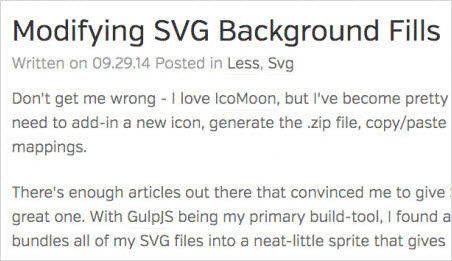
5. Modifying SVG Background Fills
For resolution-independent graphics, SVG is often a better option than icon fonts, yet while you can be quite flexible with SVG, there are a few gotchas that need a bit of thinking to get things right.
So, what if you created an icon system with symbol and use and then wanted to modify colors of the paths in SVG? Well, you can use the mysterious
fill: currentColor to reuse the color within your SVG. But if you want to specify SVG as background, you can't use color to modify the fill color. The workaround is to modify the fill attribute of the SVG itself within the data URI source with a LESS mixin. Need a SASS mixin instead? Here's how you can convert mixins from LESS to SASS. Another headache prevented! (vf)6. Shorten Your Gulp And Grunt Build Processes
While automating build processes is becoming a common tool in development, some developers feel more comfortable with Grunt, while others prefer Gulp. Both tools are helpful and time saving for repetitive tasks, yet ironically enough, setting it all up and fiddling with the config files can be quite time consuming — and there are so many boilerplates out there to start with! Which one to choose?
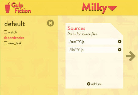
Gulp Fiction was built to help shorten the time it takes to set up a proper build process. It enables visual editing of your Gulp files and automatically generates Gulp config files. It also searches for recommended steps and build tasks with the npm repository, so you can select the most useful tasks, as verified by its creators. If you prefer Grunt, you can optimize the maintenance of your Grunt files with Supercharging your Gruntfile and More Maintainable Grunt. Making fast processes even faster, one build step at a time! (ml)
7. Learning Has Never Been Easier: Smashing Workshops
With so many techniques, tools, libraries, design patterns, strategies, abstractions, frameworks and boilerplates available nowadays, what do you really need to know to keep your workflow fast, smart and efficient? That's exactly what our front-end and RWD workshops are all about: practical front-end + RWD workshops that will help you become better front-end developers and designers, today.
UPCOMING ONLINE WORKSHOPS:
- Advanced RWD Front-End & Performancewith Vitaly Friedman (Nov. 19)
- JavaScript Graphics & Animationwith Seb Lee-Delisle (Dec. 2)
- JavaScript Interaction & Animationwith Seb Lee-Delisle (Dec. 3)
FULL-DAY WORKSHOP IN NEW YORK CITY, USA:
- RWD: Clever Tricks & Techniqueswith Vitaly Friedman (Dec. 3)
FULL-DAY WORKSHOPS IN OXFORD, UK:
- Leveling Up With Flexboxwith Zoe M. Gillenwater (Mar. 16)
- Idea Factorieswith Chris Murphy (Mar. 16)
- Responsive UXwith Marko Dugonjić (Mar. 19)
- MORE WORKSHOPS IN OXFORD →
FULL-DAY WORKSHOPS IN WHISTLER, CANADA:
- Offline Firstwith John Allsopp (Dec. 9)
- Responsive Imageswith Yoav Weiss (Dec. 9)
- Building Performant Websiteswith Tim Kadlec (Dec. 12)
- MORE WORKSHOPS IN WHISTLER →
Or, if you'd like to run an in-house workshop at your office, feel free to get in touch with Vitaly at vitaly@smashingconf.comand briefly describe what problems you're facing and would like to solve. Don't worry about the costs — we'll find a fair price for sure. Get in touch — it's that easy!
New on Smashing Job Board
Here are the recent job openings published on our Smashing Job Board:
- Freelance web designer at UpTrending (100% Remote)
We're looking for a freelance designer who is tech-savvy and sees the Internet as a playground, with a passion for coding. - Web Designer at The Michael J Fox Foundation (NYC)
We're looking for a talented, user-focused web designer to help guide a redesign of its website, MichaelJFox.org, and execute ongoing web design projects across the Foundation, including mobile and desktop-based websites and applications, microsites, landing pages and email templates. - Visual Designer at Pratice Fusion (SF, CA)
We're looking for a senior visual designer who is both idealistic and pragmatic, and likes to push the envelope on how to communicate value through design.
Smashing Highlights (From Our Archive)
- Festive Christmas Icon Pack (20 .EPS Icons)
The year is slowly coming to an end and we're glad to present to you a festive icon set to inspire you in your designs. In this post we present a minimalist collection of 20 free festive vector (.EPS) icons created by the crew at offset media. - Smart Transitions In User Experience Design
Some websites outperform others, whether in their content, usability, design, or features. We'll share some lessons drawn from various models and analyze why these simple patterns work so well. - Designing CSS Layouts With Flexbox Is As Easy As Pie
Flexible box layout (or flexbox) is one of the first CSS modules designed for actual layout (floats were really meant mostly for things such as wrapping text around images), it makes a lot of tasks much easier, or even possible at all.


댓글 없음:
댓글 쓰기