Dear Friends,
Navigation on mobile is a common topic in design conversations, and it often boils down to a simple compromise on hiding navigation behind an icon and showing it on demand. Perhaps with a toggle behind a hamburger icon, or a large overlay, or a good old-fashioned off-canvas. While these conversations help us decide on the interaction used, it's just as important to think about where this interaction takes place.
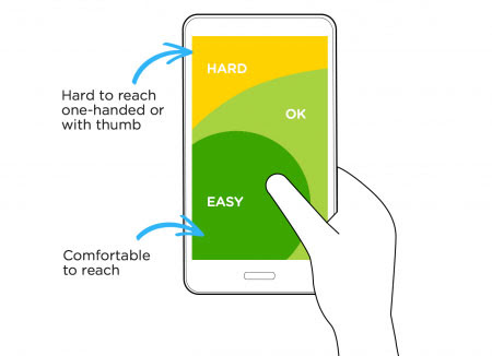
Usually, navigation toggles are placed in the area where they arepotentially difficult to access: on the right or left upper corners in the header — often within a persistent overlay. However, since many users prefer the one-handed grip to access the content, our designs must accommodate for thumbs, making it easy for users to click on those shiny navigation buttons of ours.
So, as the physical dimensions of mobile devices get larger, it may be a better idea to make navigation accessible at the bottom of the screen instead? Or have a floating toggle to open and close navigation somewhere at the left bottom of the screen? Perhaps it could become more transparent as the user keeps scrolling down the page. Or, for complex interfaces, perhaps consider using tabbed navigation with primary options in the left bottom corner?
A lot of options, but all of them better suited for many scenarios in which users would feel much more comfortable with your navigation controls.
Happy mobile designing!
– Vitaly (@smashingmag)
– Vitaly (@smashingmag)
Table of Contents
1. Beautiful UI Is Beautiful Copy
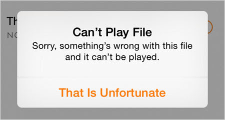
Great interfaces don't visualize features, but communicate messages instead. What's a better way to communicate than with a well-written, purposefully curated copy? In fact, before even thinking about the information architecture and visual design of the interface, how about opening a text editor and writing down the meaningful, purposeful wording for critical UI components first? Writing-First Design, anyone?
If you're in need of a bit of inspiration, Content Snippets, a growing resource of examples of well-written copy, could prove quite useful. If you're rather working on a redesign, an interface inventory template might prove quite useful to audit and prepare an overview of UI components early on in the process. Now, wouldn't you simply love a friendly, helpful interface speaking a sort of convenient and friendly language to your users? (vf)
2. Keeping An Eye On Your Stylesheets
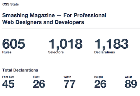
Stylesheets tend to become cluttered quite quickly, especially if multiple teams are involved in the front-end work. How do your stylesheets hold up in terms of file size and specificity scores? To get to the bottom of this, Adam Morse and Brent Jackson created CSS Stats, a little tool that visualizes all kinds of interesting stats about stylesheets.
Whether it's the number of rules, selectors, declarations and properties that are defined, or even colors, media queries and font-families used, CSS Stats lets you collect data like these on any site. Just enter an URL or paste in raw CSS and the tool does the rest. Perfect to keep an eye on your stylesheets or just to get some insights into how other developers work. (cm)
3. UI Motion Experiments
There are a number of ways to create a beautiful, delightful interaction, and one of the most useful tools to achieve just that are transitions and animations. In fact, while Navigation Transitions spec is in the works, when it comes to micro-interactions in our user interfaces, a simple transition can go a long way.
Michael Vellar's motion experiments feature a few examples of interesting, subtle yet delightful interaction patterns, such as a thumb zone-optimized toggle menu, adding an item, or animated search. Also, if you want to go deeper into the details of creating animations and interactions based on the laws of physics, Ralph Thomas' article on physics-based interactions (a quite lengthy one!) is worth a read. And there you go! Nothing stands in the way of more delightful interactions any longer! (vf)
4. currentColor, A Little Helpful CSS Property
You can do pretty much anything with (relative) simple CSS, yet if you'd like to build truly flexible, scalable systems, even little styling issues might need reconsideration here and there. In fact, we could all save quite a number of CSS lines if we just used the
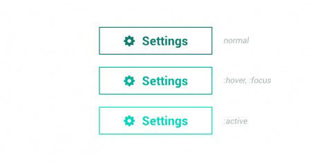
currentColor CSS property, you know, properly.currentColor allows us to reuse the color properties that aren't inherited by child's elements by default. For example, if you want your SVG button to have the color of the text, or your arrow in a text link to inherit the color of the link, or the horizontal line to inherit the text color, you can achieve all of this without the use of "proper" CSS variables or preprocessors, with (guess what?) only one single line of CSS. The currentColor property is supported in modern browsers, starting with IE9+. In his article,Keeping CSS Short With currentColor, Osvaldas Valutis provides a few examples of what you can do to achieve just that. A little nifty helper for those sneaky CSS issues. (vf)5. A Full-Fledged SVG Editor In Your Browser
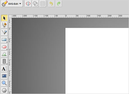
SVG is a wonderful way to cater for crisp and sharp images no matter which screen resolution. You can make basic changes right in the markup, but if the changes are a bit more involved, you might need a quick SVG editor at hand. So if you're still looking for one, you might want to give SVG-edit a try. It's a free, completely web-based SVG editor, and it works in any modern browser.
The features that SVG-edit has to offer are quite extensive. Not only can you view and edit an SVG source in there, but also make use of a number of drawing options and import functions to create your own SVGs from scratch. Convenient, fast and definitely worth checking out. Happy SVGing! (cm)
6. For The Love Of... Triangles!
Triangles! What? Seriously, what can be so spectacular about triangles? Well, apparently, every triangle has a story — a story to tell, and a story to share. Indeed, triangles can have quite unique personalities, and perhaps even a sense of purpose. That's why Varun Vachhar keeps adding A Triangle Every Dayto his growing collection of, you know, triangles.
Admittedly, every single object featured in this little library is an artwork of its own — within its own unique environment, and with a standalone role assigned to it. Some triangles fall in love, others get lost in space, and others are built out of checkboxes. You can be creative with anything! Even a simple triangle can become quite a character with enough imagination and design skill. Now, what about circles? (vf)
7. Learning Has Never Been Easier
With so many techniques, tools, libraries, design patterns, strategies, abstractions, frameworks and boilerplates available nowadays, what do you really need to know to keep your workflow fast, smart and efficient? That's exactly what our front-end and RWD workshops are all about: practical front-end + RWD workshops that will help you become better front-end developers and designers, today.
FULL-DAY WORKSHOP IN NEW YORK CITY, USA:
- RWD: Clever Tricks & Techniqueswith Vitaly Friedman (Dec. 3)
FULL-DAY WORKSHOPS IN WHISTLER, CANADA:
- Everything About RWDwith Brad Frost (Dec. 9)
- Offline Firstwith John Allsopp (Dec. 9)
- Responsive Imageswith Yoav Weiss (Dec. 9)
- Responsive Design Workflowwith Stephen Hay (Dec. 9)
- Building Performant Websiteswith Tim Kadlec (Dec. 12)
- Creative CSSwith Val Head (Dec. 12)
- RWD Tips & Techniqueswith Vitaly Friedman (Dec. 12)
UPCOMING ONLINE WORKSHOPS:
- Advanced RWD Design & UXwith Vitaly Friedman (March 2)
- Advanced RWD Front-End Perf.with Vitaly Friedman (March 3)
FULL-DAY WORKSHOP IN EDINBURGH, UK:
- Responsive Tips & Trickswith Vitaly Friedman (March 6)
FULL-DAY WORKSHOP IN ATLANTA, GA, USA:
- Responsive Tips & Trickswith Vitaly Friedman (April 24)
Or, if you'd like to run an in-house workshop at your office, feel free to get in touch with Vitaly at vitaly@smashingconf.comand briefly describe what problems you're facing and would like to solve. Don't worry about the costs — we'll find a fair price for sure. Get in touch — it's that easy!
New on Smashing Job Board
Here are the recent job openings published on our Smashing Job Board:
- Web Design Instructor at Tuts+ (Anywhere)
We're looking for an instructor who understands what makes things work with decision-making processes behind web design. - PHP Expert at Goodgame Studios (Hamburg, DE)
We're looking for a PHP developer who will work on our back-end systems such as our payment shop and our in-house core library. - Senior UI Designer at Apttus (San Mateo, CA)
We're looking for a talented designer who will develop UI standards and best practices for user interfaces for desktop, tablet, and smartphone browsers and mobile devices.
Smashing Highlights (From Our Archive)
- Christmas Icon Set (10 Quality Icons, 256×256px PNG)
This icon set contains ten icons available as 256×256px PNGs that have been lovingly and exclusively prepared for Smashing Magazine and the Web design community. As usual, the set is released under a Creative Commons license and can be used in commercial and private projects. - The Z-Index CSS Property: A Comprehensive Look
Most CSS properties are quite simple to deal with. Often, applying a CSS property to an element in your markup will have instant results — as soon as you refresh the page, the value set for the property takes effect, and you see the result immediately. - 10 Useful Usability Findings and Guidelines
Everyone would agree that usability is an important aspect of Web design. Whether you're working on a portfolio website, online store or Web app, making your pages easy and enjoyable for your visitors to use is key.
Recent Articles On Smashing Magazine
- Desktop Wallpaper Calendars: December 2014
- Making A Complete Polyfill For The HTML5 Details Element
- Introducing SmashingConf Los Angeles 2015
- Freebie: Christmas Icon Set (24, Icons)
- How To Create Your Own Front-End Website Testing Plan
- Why You Should Include Your Developer In The Design Process
- Refining Your Mobile Onboarding Experience
- The State Of Animation 2014





댓글 없음:
댓글 쓰기